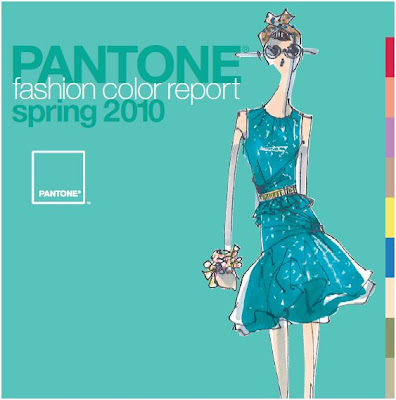
 "Now more than ever, women are vigilant when it comes to spending," said Leatrice Eiseman, executive director of the Pantone Color Institute. "Instead of re-inventing their wardrobe at the start of each season, consumers want pieces to complement what they already own. Pairing a bold color with a basic piece or freshening up their look with bright accents addresses the need for practicality, as well as fun."
Designers bring splashes of sunshine to the runway for spring 2010. Vibrant brights add a sense of excitement to the color palette, while practical neutrals provide a safety net for cautious consumers. “Now more than ever, women are vigilant when it comes to spending,” said Leatrice Eiseman, executive director of the Pantone Color Institute®. “Instead of reinventing their wardrobe at the start of each season, consumers want pieces to complement what they already own. Pairing a bold color with a basic piece or freshening up their look with bright accents addresses the need for practicality, as well as fun.”
Spring
 and summer naturally evoke feelings of calm ocean waters and tranquil beach vacations in cool, vibrant, tropical Turquoise.
This soothing hue from the blue-green family conjures feelings of escape, especially when paired with Amparo Blue. With more warmth than the typical spring navy, this particular shade of blue is extremely appealing because of its brighter, more energetic attitude.
Like the scent of a blossoming flower, Violet lends a romantic air to the warm-weather palette. This intriguing purplish hue is a distinctive addition to any wardrobe.
Yellow has made its mark on fashion and spring will further this trend with gleaming Aurora. Reminiscent of the first glimpse of yellow as the sun begins to rise over the horizon, this shimmering, slightly greenish yellow adds a bold infusion.
Energy continues to surge throughout the warmer hues of spring, leading to provocative Fusion Coral. This inviting orange connects directly to tangy Tomato Purée, this season’s classic red. Pair it with Turquoise for a retro look.
Thoughtful, cautious neutrals provide a dependable backbone to the brights of spring.
Kick back and enjoy the bubbly luxury of Pink Champagne. This delicate, wispy tint is the season’s newest neutral. The melding of Pink Champagne, Tomato Purée and Amparo Blue is a refreshing take on the classic springtime combination of red, white and blue. Three additional neutrals round out the palette.
Tuscany, a warm beige hue, provides the perfect backdrop and works well as a solid base color with dynamic accents like Fusion Coral or Violet.
Dried Herb is the ultimate green neutral, pairing well with all other colors. Ideal for bigger ticket items, cool Eucalyptus is the eternal, practical gray. Choose this nuanced neutral and add brightly colored exclamation points in shoes, jewelry and handbags.
(Source: Pantone)

No comments:
Post a Comment